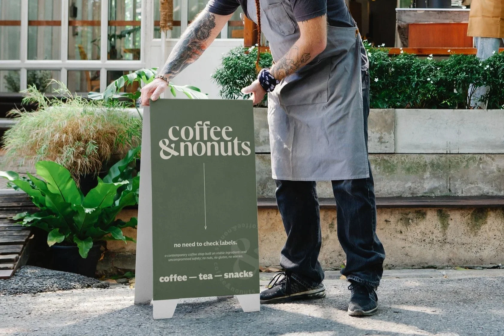
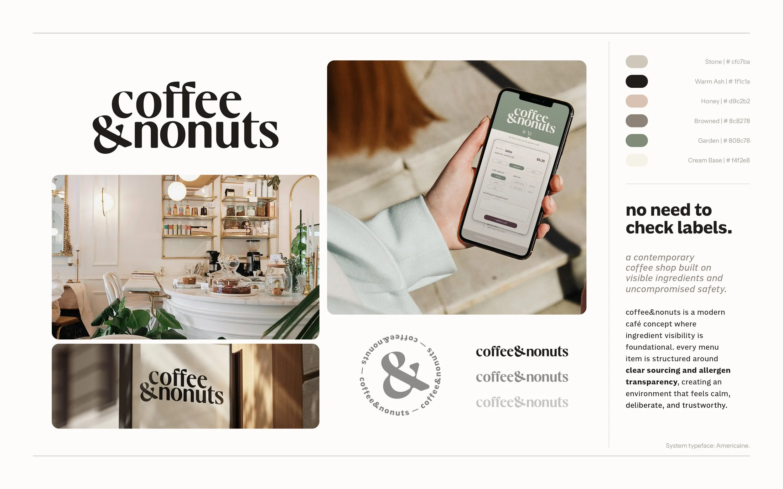
coffee&nonuts
coffee&nonuts is a speculative café brand built around a simple premise: when safety is guaranteed, the experience can finally feel normal.
For many people with severe allergies, ordering at a café involves quiet risk assessment. Menus are scanned, questions are asked, preparation methods are double-checked, and a decision is made about whether the environment feels safe enough. That cognitive work happens before the experience even begins. This project starts with that tension and removes it at the structural level.
The concept is operational first: no nuts, no gluten, and clear preparation standards. The brand is then designed to feel like any strong neighborhood café rather than a specialty facility. Menus are organized by category, not restriction. Allergen information is visible but not segregated. Typography is warm and steady rather than playful or clinical. The tone communicates legitimacy without becoming overly formal.
The same logic extends into a simple app flow, where structure carries the brand’s promise into interaction. There are no alternate paths or special modes, only consistent systems applied across formats. Including interaction work here is intentional. It shows the ability to translate a brand concept into behavior, demonstrating structural thinking that moves beyond static visuals while remaining grounded in practical execution.